

App Description
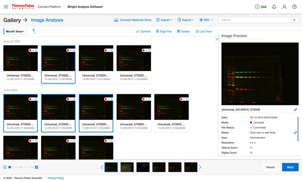
Thermo Fisher’s iBright Analysis Software is used by researchers to analyze western blots, gels, and fluorescence imaging data. Despite its powerful capabilities, the experience was not keeping up with user expectations around speed, clarity, and ease of use.
- Overview
- Product:iBright Analysis Software
- Project Type:UX/UI
- Role:UX Designer (Team-based)
- Audience:Research Scientist, Lab Technician.
- Design System:Komodo Design Guidelines
- ToolsFigma · Miro · UserTesting · Adobe Suite
- Safe :This project is presented in a portfolio-safe, external-facing format.
UX Revamp Case Study
This case study highlights a UX redesign aimed at improving usability, reducing cognitive load, and enhancing overall user satisfaction. The project reimagines the core experience to make analysis faster, more intuitive, and closely aligned with real-world lab workflows.
The Challenge
Researchers work in time-sensitive environments where accuracy and efficiency are critical. However, the existing experience created friction:
Users faced:
- Users struggled to learn the system without training
- Core workflows felt fragmented and multi-step heavy
- UI clutter made it hard to find the right tools quickly
- Comparing results across samples was inefficient
My Role
- UX Research & Synthesis
- Interaction & UX Design
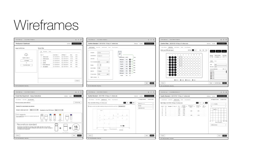
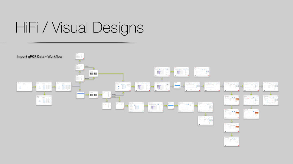
- Wireframing & Prototyping
- Usability Testing
Research & Insights
Led end-to-end research initiatives to understand user workflows, unmet needs, and product-market fit opportunities in scientific software and life sciences solutions. Applied mixed-method research approaches to translate complex technical requirements into actionable product insights.
Methods
- 1:1 interviews with researchers and lab technicians
- Usability testing on existing product
- Heuristic evaluation
- Competitive benchmarking (Bio-Rad, Azure)
Key Insights
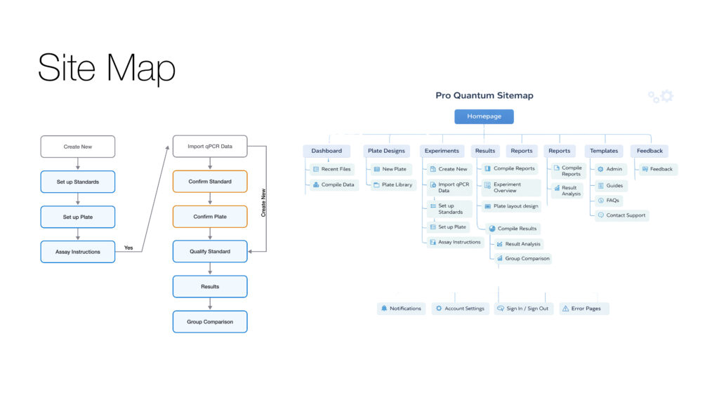
- Workflows are predictable — Most users follow: Import → Adjust → Analyze → Export
- Speed > feature depth — Users prefer faster completion over advanced flexibility
- Guidance reduces anxiety — Especially for new or infrequent users
- Visual clarity is critical — Misinterpretation of data is a major risk
What We Did
- User interviews with lab technicians and academic researchers
- Workflow walkthroughs of common ProQuantum tasks
- Heuristic evaluation against Komodo UX principles
- Collaboration with product managers and application scientists
- Collaboration with product managers and application scientists
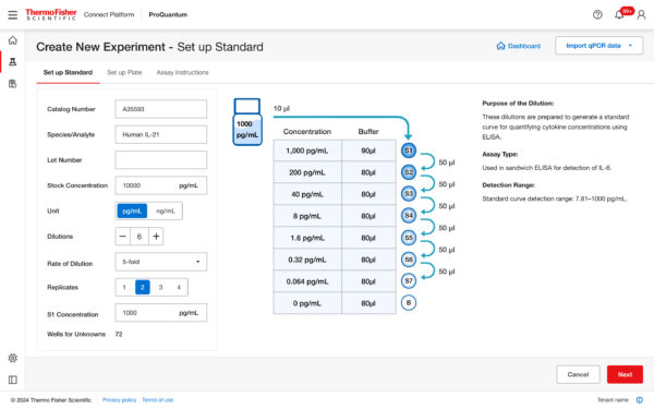
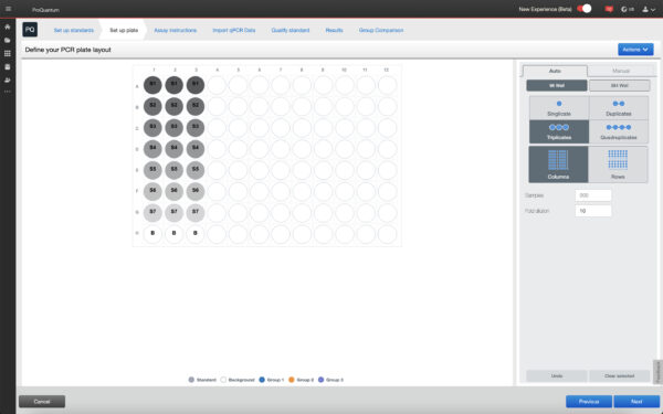
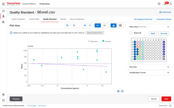
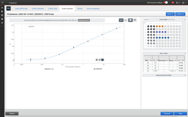
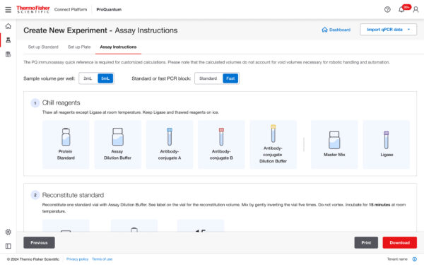
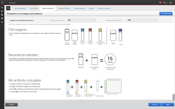
New Design
Old Design
What We Did
- User interviews with lab technicians and academic researchers
- Workflow walkthroughs of common ProQuantum tasks
- Heuristic evaluation against Komodo UX principles
- Collaboration with product managers and application scientists
- Collaboration with product managers and application scientists
- Users rely on step-by-step mental validation during assays
- Clear system feedback builds more trust than advanced visuals
- Progressive disclosure works better than information-dense dashboards
- Consistency across steps reduces anxiety during high-stakes runs
New Design
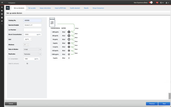
Old Design
What We Did
- User interviews with lab technicians and academic researchers
- Workflow walkthroughs of common ProQuantum tasks
- Heuristic evaluation against Komodo UX principles
- Collaboration with product managers and application scientists
- Collaboration with product managers and application scientists
- Users rely on step-by-step mental validation during assays
- Clear system feedback builds more trust than advanced visuals
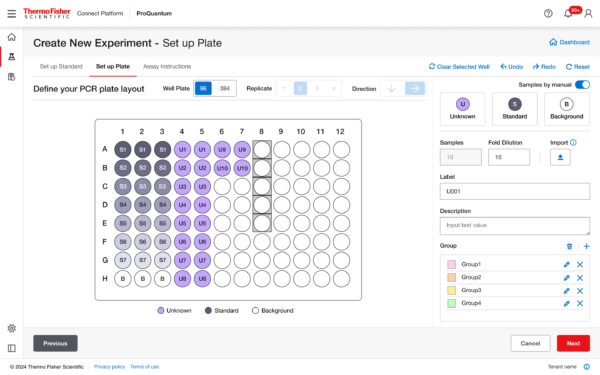
New Design
Old Design
What We Did
- User interviews with lab technicians and academic researchers
- Workflow walkthroughs of common ProQuantum tasks
- Heuristic evaluation against Komodo UX principles
- Collaboration with product managers and application scientists
- Collaboration with product managers and application scientists
- Collaboration with product managers and application scientists
- Users rely on step-by-step mental validation during assays
- Clear system feedback builds more trust than advanced visuals
- Progressive disclosure works better than information-dense dashboards
- Consistency across steps reduces anxiety during high-stakes runs
New Design
Old Design
What We Did
- User interviews with lab technicians and academic researchers
- Workflow walkthroughs of common ProQuantum tasks
- Heuristic evaluation against Komodo UX principles
- Collaboration with product managers and application scientists
- Collaboration with product managers and application scientists
- Users rely on step-by-step mental validation during assays
- Clear system feedback builds more trust than advanced visuals
- Progressive disclosure works better than information-dense dashboards
The Breakthrough
Shifted the experience from a feature-heavy interface to a workflow-driven design. Instead of making users figure out tools, the system guides them through clear steps aligned with real lab workflows — reducing cognitive load, errors, and time to complete tasks.
Our Process
Here is my Services. Where you will find my creativity and my working talents.
User Research
Conducted interviews & usability tests
Wireframing
Created new task flows & wireframes
UI Design
Built and modern, intuitive UI
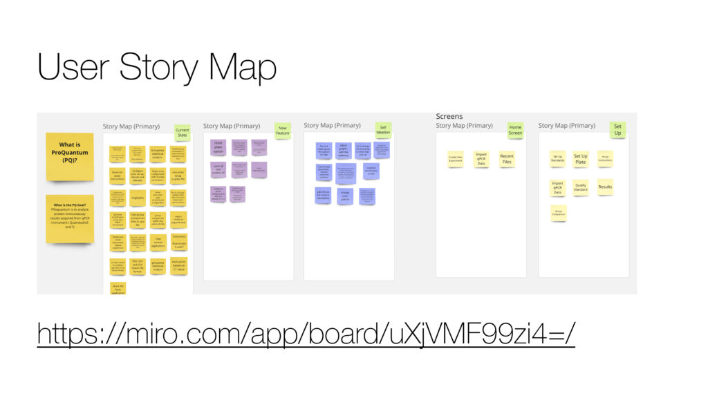
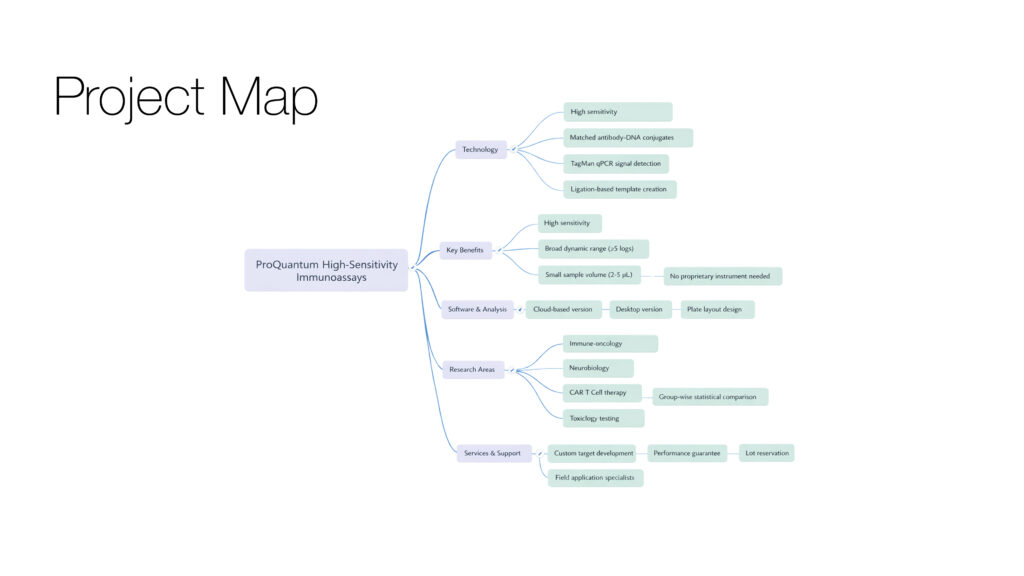
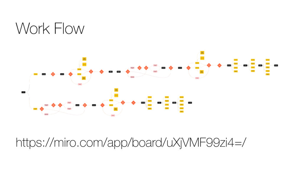
UX Artifacts
Here is my Services. Where you will find my creativity and my working talents.
Outcome & Reflection
Reduced task time and errors significantly by aligning the interface with user workflows, reinforcing that structured, guided experiences drive efficiency, confidence, and better outcomes.